Corporate Website


Born and raised in Thessaloniki, Greece, Argyrios Kaltsios studied Architectural Engineering at the University of Wales, UK, where he also obtained two postgraduate degrees at the fields of Environmental Design of Buildings and Conservation of Historic Buildings. Along with his career as an architect, he is occupied with writing literature and translating books and articles while, in the past, he taught History of Art & Architecture at private colleges.
About the Project
Argyris wanted us to implement a website through through which he could promote his works beautifully and effectively.

Implementation
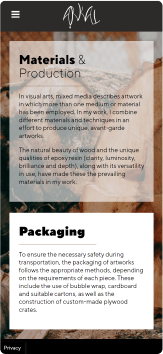
The new, fully responsive website focuses on structure, functionality and visual appeal. Using raw multimedia material from our client, we created an understandable structure that gradually presents to the user, as he browses, all the information about the works and theis special info.

During the implementation of the website we used typography and several graphic icons in order to achieve the difference in the design. Argyris’ works are illuminated and we managed to highlight this particularity by using a switch which by pressing it the light of the project lights up.
Content Presentation
All the special information about Argyris’s works are being presented in a friendly and understandable way. By presenting his works, sorted in categories, directly οn the frontpage of the website, the user can have a quick look and easily access to their details.

Responsive Design


The website was built based on the techniques of Responsive Web Design and mobile first web design. Responsive design allows visitors to effectively view a website from any device they use for their browsing. The design and orientation of the elements are being moved and changed so that they are displayed correctly on a desktop, laptop, tablet or smartphone. Images and content shrink and fit from three columns to two, and finally to a content column as the website automatically recognizes the screen resolution used by the visitor.


Visit site
